I love making letters! Back in college, my painting professor, Aaron Gosser told us that when you set out to make abstract work, it helps a lot to have something to base the beginning on. I like letterforms for this reason—they are a great little frame to build abstract forms around!
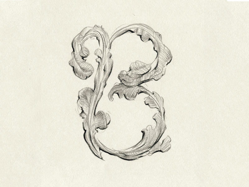
Feathers: Here's one of my Drop Cap drawings for the letter B: I loved the feeling of the smaller curled hatching on the feathers mirroring the larger curls of the B shape.
Ink: I took this freehand drawing I made in ink, and colored it with a watercolor piece to create this stained letter B. I loved feeling surprised at the different aesthetic created just by changing the outlines to solid shapes!
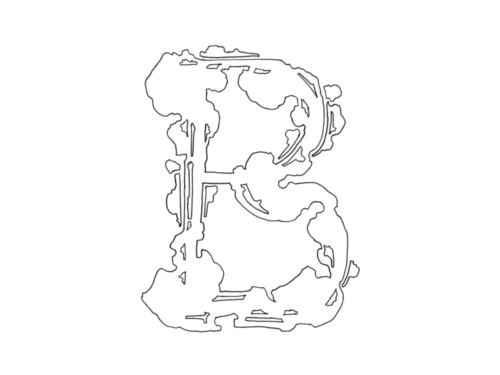
Freehand drawing of the letter B. I am really inspired by Art Nouveau and Alphonse Mucha! The way his organic forms play between and flow into geometric shapes is so enchanting—and really addicting to draw.

Making using the solid shapes, I added watercolor. I am really into this color combination, I realized it's the same one as my Dreaming in Flowers piece!